
In this guide will cover indepth the different types of technical analysis and how they can be used for trading including:
- Support and resistance
- Moving averages
- Momentum indicators
- Price breakouts
- Trend changes
- Group analysis
What is technical analysis?
Technical analysis is a type of trading that identifies opportunities by historical patterns such as price action and volume.
How to use support and resistance levels in trading
One enduring feature of market analysis is the imposition of lines on charts. Two popular ones are support and resistance trendlines. But how useful are these trendlines? Do they really improve our market analysis and trading success?
To answer these questions, we first need to know what support and resistance are. Consider this price sequence:
20—50—20—50—20—50
Immediately, you can see that the support is at 20 and the resistance at 50. In other words, a support is an area of demand, whilst a resistance is an area of supply. Logically, prices fall from resistance; and rise from support.
In actual financial markets, however, randomness pervades. This means that prices are more likely to look like:
21—52—23—46—26—44
Where are the support and resistance (S/R) now? Far harder to know. The resistance could be 50, 48 or 45.
Our next question, then, is this: Which sequence would you bet? I suspect the first one. Why? Because it offers relatively more ‘certainty’ due to its better defined price pattern. This certainty gives you, as an investor, more confident that prices will continue to behave 20—50—20—50…
Therefore, just with these simple observations we note:
Observation 1 – S/R trendlines are one way to see ‘patterns’ in financial prices. Nothing more, nothing less. Trade management still counts.
Observation 2 – S/R trendlines are ‘self-reinforcing’, meaning that the more people look at it, the more significant it will be. And the better defined the chart patterns are, the more people will look at it. So pick the most obvious ones.
Observation 3 – Peaks and troughs are seldom ‘exact’. Prices don’t peak at 7000.00 but at 7012.15. So when drawing S/R, remember to give prices room to move. ‘Trend bands’ are slightly better than trendlines.
Application – FTSE 100 Index
To tie these observations into chart analysis, we look at the UK FTSE 100 Index.
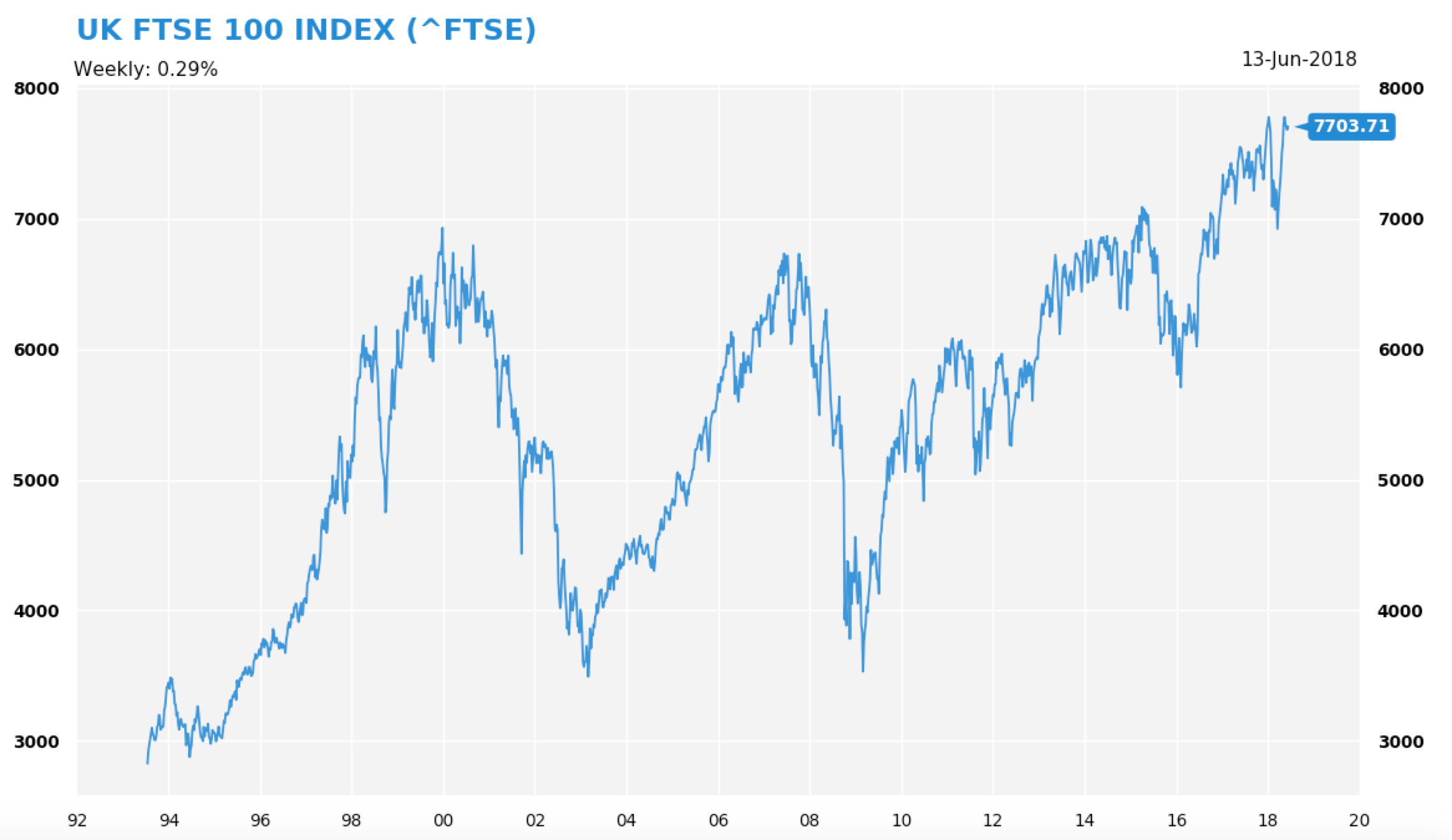
During 1998-2018, where do you think was the obvious resistance level? 7,000 of course. Thrice the index rallied to this level and failed twice to break above this level. And support? Hmmm, I would pick 3,500 – a level reaffirmed twice, in 2003 and 2008. But on recent data, 5,000 or 6,000 are two candidates.
Without going into a deep analysis on Footsie’s valuation or UK’s macro performance, which directional bias is the FTSE 100 on: Up or down? Certainly up. This is because prices are closer to its long-term resistance than support.
Note further that, in late 2016 when Footsie cleared the 7,000 resistance, this made headlines (eg, ’FTSE in Uncharted Territory’) and drew in many momentum buyers. The breakout at 7,000 gave way to a year-long, 800-point rally. This leads us to the next two S/R observations:
Observation 4 – S/R trendlines that coincide at big round number levels attract the most attention.
Observation 5 – A break of these levels generates price momentum in the direction of the breakout. So join the crowd.
Conclusion
S/R are useful charting tools to analyse markets. But they are not everyone’s cup of tea. If you are keen on them, do keep in mind the above observations and make S/R trendlines really simple. In my experience, over-complicated trendlines often lead to ‘analysis paralysis’, which is detrimental to investment success. A consistent, logical application of long-term S/R trendlines will make your analysis far more efficient – and makes you better attune to the prevailing trends.
Momentum indicators and trends change
Anyone who runs a marathon knows that momentum matters. It matters a lot because the sheer force of momentum can carry runners further than expected.
Similarly, momentum in prices can stretch a stock beyond what is ‘reasonably’ valued. With great momentum, a stock can go up 10x – the proverbial ten bagger! – within a short space of time.
But what exactly is momentum? In markets, price momentum is intricately linked to the rate-of-change (ROC) concept. it measures how fast or slow prices are changing. For example, a one-day ROC takes the 1-day change in prices, while a 10-day ROC is the price difference over ten days.
Consider this monotonically increasing price sequence:
10–20–30–40–50–60–70–80
Each step is $10 higher. In dollar term, the 1-day ROC is $10. (Note: in percentage term, the rate of change is dropping.) If you reverse the sequence, then the ROC becomes a negative -$10 as prices drop by this amount per step.
Of course, you can increase the parameter (which we talked about two weeks back) to 10 days, meaning you take the price difference of prices now against ten days ago – and roll this price difference forward.
But how does one use the ROC/momentum? Broadly speaking, the ROC indicator is used to detect a general change in price movements and the price trend. For example, if a stock’s ROC is $10 for some time and this increase drops to $5, $3, $1 – you know immediately that the uptrend is losing momentum. It is vulnerable to a correction.
On the flip side, if a stock’s ROC is -$10, then rises to -$5, -$3, -$1, you’ll see the downtrend is losing momentum and a rebound is possible.
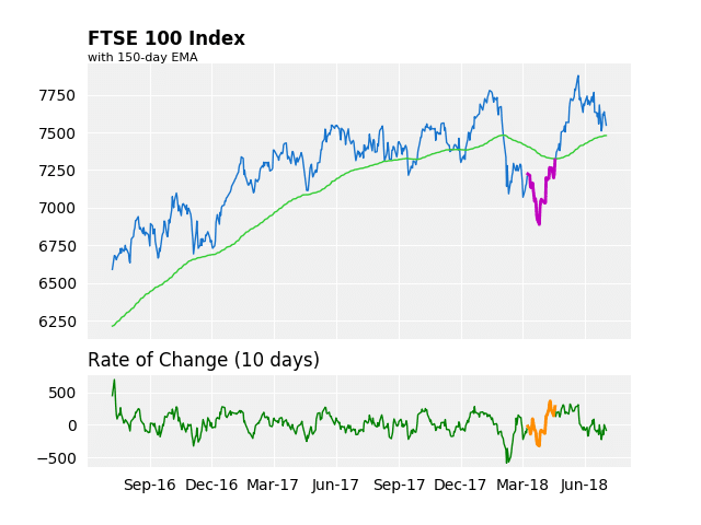
Using Rate of Change to Detect a Trend Change
We show an example of ROC time series with the FTSE 100 Index. To compute the ROC. I take the price difference to be 10 days (bottom chart).
One immediate observation is that FTSE 100’s ROC behaves rather rhythmically. This is a byproduct of FTSE 100’s steady rally post Brexit referendum. The ROC indicator swings to and fro around zero.
But things get far more interesting as the ROC jumps outside its normal range. For example. during February’s correction FTSE’s ROC slumped to its lowest level in many years. But a subsequent retest of its January lows (lower low) was not accompanied by a lower ROC.
This non-confirmation is marked by bold coloured lines in the chart. Soon enough, prices rebounded strongly for a few weeks. The FTSE 100 rallied a thousand points during Mar-Apr.
This is to say, while the FTSE 100 index was hovering near its multi-month lows, its downside momentum is actually contracting. This is a classic example of a ‘bullish divergence’.
Practical Applications of Momentum
- The ROC is just the price difference between two points in time. You can use dollar-ROC or percentage ROC. But given this simplicity, you must recognise its limitations as a momentum measure.
- You can, however, improve upon the basic ROC by:
- Combining different ROCs together – say, average the 20, 50, 100-day ROCs
- Pair ROC with other indicators – such as the moving average
- Set further conditions on the ROC – say, the indicator must rise/fall to x-level before you would consider using it
- Vary the ROC calculations
- From my experience, ROC/Momentum indicators appear to work better on the downside than the upside. This is to say, momentum indicators detect non-confirmation better after a strong decline.
- Lastly, the ROC does not give signals every day. Its usefulness lies in non-confirmation of trend assertions, which takes place over many weeks or months.
In a nutshell, the ROC is a useful indicator for measuring price momentum. But to use this indicator effectively, you will need to backtest – or at least visually inspect – its behaviour over many instruments across a period of time. Personalise the ROC configuration to compliment your other favourite indicators. Keep practicing on this indicator until you’re comfortable with it – and know when to use it.
Price Patterns FAQ
Q: What are price patterns?
Price patterns are recurring price behaviour that are observed visually (and can be modelled by computers). This key here is ‘recurring’. If a price pattern is not repeating, then it is just random noise.
The act of finding price patterns is called “pattern recognition”.
Q: How can price patterns be used in market speculation and investing?
When a pattern is repeating, it can be predictive and harnessed for profitable trading activities. To do this, the pattern must be (a) identified, (b) measured, and (c) traded upon profitably.
However, there are times when (a) and (b) are satisfied, but not (c). A pattern may exist, but it still can not be traded profitably because of, say, high transaction costs.
Q: What is the best place to start looking for price patterns?
I would say charts. A lot of price patterns are found visually. You can use line, bar or candlestick charts. The point-and-figure chart is also useful.
Next, you might want to vary the frequency of the charts. Some patterns could be more obvious if you switch to Weekly Bar charts, for example. Some are more applicable on Daily Candlestick. You can split pattern by frequency:
- Daily Pattern – Pattern 1, Pattern 2,… etc
- Weekly Pattern – Pattern 2, Pattern 2,… etc
Q: How do you determine if a price pattern has emerged?
To check if you have found a pattern, you need to ask:
- Have you seen this before? Where?
- What happened then? Describe it.
- What were the actions preceding the pattern? This could be important as you’re determining the factors leading to the pattern.
Once you answer some of these basic questions, you will know quickly if the pattern is indeed a pattern.
Q: Once you have identified a pattern, what is the next step?
Verify the pattern. Is the pattern random or regular? How big are the price returns pre- and post-pattern? Is the pattern long-, medium-, or short-term (duration)? Can you act fast enough to capture it? Is the pattern profitable once transaction, spreads, and other costs are factored in?
To answer these questions, you will need to be able to describe the idea, then backtest the idea. The action flow is something like this:
Observe -> Pattern Found -> Description of Pattern (Models) -> Backtest -> Results (Analysis) -> Trade
Q: What sort of price patterns are there?
There are many hundreds of price patterns used by traders, funds, or investors. For obvious reasons, the more profitable ones are probably kept hidden from the public. In general,
- Calendar Based – eg, Month of the Year or January Effect
- Sequence Based – eg, Runs Analysis
- Trend Based – e.g., Head-and-Shoulders
- Return Based – e.g., Daily/Weekly Returns, 52-Week Returns
- Short-Term Pattern – e.g., Price Gaps, Reversal Day
- Plot Based – e.g., Point-And-Figure
- Cycle Based – e.g., early/mature bull markets
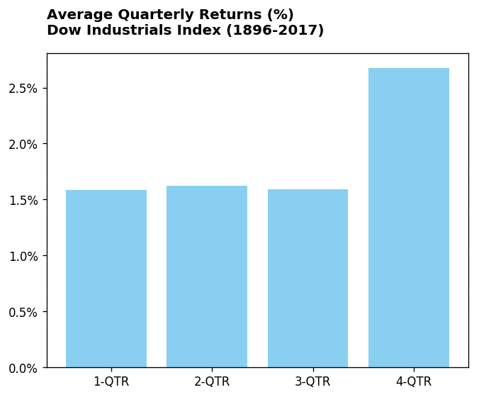
etc. One of the simplest calendar pattern I can think of is the Quarterly Effect in equity indices. For example, the ‘Santa Claus’ rally is evident in the DJ Industrial Index, whereby the last quarter of the year generates, on average, the highest return compared to other quarters.
Q: How do we choose which patterns to incorporate into our trading plan?
One important consideration is consistency. Is the pattern reliable?
Reliability here refers to behaviour of returns. If a pattern generates lots of small profitable trades and then proceed to lose big in one trade, then one has to be really careful about using it. If a pattern has lots of small unprofitable trades and win big in a few signals, it might still be viable.
The next issue is its scalability. Is the pattern applicable to other markets, sectors, or asset classes? Can it be scaled up with more capital? This issue has to be researched and tested rigorously – simply because it is dependent on the actual pattern, depth of markets, and capital deployed.
The last issue is shelf-life. How long has the pattern been observed? Is there any studies on it? Is it widely known? Generally, the more capital chasing the pattern, the shorter its shelf-life will be. This is due to a principle of capitalism: Returns fall as capital employed rises.
Q: What about combining patterns?
As a rule of thumb, the simpler the pattern the better. A complex pattern will probably contain too many variables and this may impact its effectiveness. For example, is a complex head-and-shoulders really better than a normal head-and-shoulders? I doubt so.
Conclusion
In the realm of market analysis, price patterns are an important part of it. But not all patterns are equal. Some are profitable; some are money-losing. Some work for a time, then fade away. Some work in stocks, but not in others. So a lot of research is required to extract good trading/investing ideas.
Lastly, if you found one good pattern, try to develop little trades around this pattern to maximise its usefulness. In my experience, it is better to focus on a few good patterns rather than a lot of marginal ones. Diversify, but only to a point.
The Importance of Group Analysis
There is an old saying that ‘birds of the same feather flock together.’ In financial markets, this is particularly true.
Behind this groupthink is pure human psychology. Investors think in concepts; they act in concert. If the sentiment is bullish on a theme, why stop at buying a single stock? Surely more money could be made by buying the whole sector.
Indeed. The fact that investors are enamoured by FAANGS (or BRICS) show the pulling power of investment themes. Funds have been setup to do this sort of group investments for investors.
Another force behind group movements is risk consideration. Smart investors care about diversification. They know that picking the ultimate winner in a bull market is difficult. So they buy the whole thing – either with index or sector ETFs (exchanged traded funds), or the largest, or most profitable, or the highest-yielding stocks within the sector. This way, some individual stock-picking risks are reduced.
The third factor driving sector-wide moves is the channeling of accumulated profits. If stocks A,B,C are in the same industry and A‘s share price suddenly tripled, investors of A will now have excess profits to play with. They can either take profits, do nothing, or increase exposure to the sector via higher leverage. Human nature, often drive by fear and greed, dictates the latter. So investors of A will likely use profits from A to buy B and C, thus pushing up their share prices.
A pertinent example of this is the Cryto-Currency boom in 2017. As Bitcoin’s price surged ten-fold, wealthy Bitcoin owners went in search of new opportunities in the same sector. This triggered a frantic buying of other currencies, sending their prices stratospheric.
Initiating Sector Analysis
How does one identify a sector that is about to take off? Conducting a group analysis is straightforward. The first few steps are:
One, know the broad sectors within the equity market. According to the Global Industry Classification Standard (GICS), there are eleven industry groupings* (see below). Obviously, some markets are stronger in certain sectors. For example, British equity markets are inclined towards financials and property while Germany is stronger in industrial groups. In the US, the technology sector is extremely large and powerful.
Two, know the sector indices (if any) and its constituents. This is important because within a broad sector there are many subsectors. This binds stocks even closer. For example, within the Financial sector there are banks, asset managers, insurance, brokerages etc. Stocks within a subsector have a higher correlation.
Three, know the sector ETFs (if any). This is to build an investable universe.
Questions for Sector Analysis
Once we have the above information, we can conduct the actual group analysis. In particular,
- Which GICS sector is performing? Rank their simple returns (e.g., 2/4/10/26/52-week performance)
- For each GICS sector:
- rank constituents by their simple returns (2/4/10/26/52-week).
- calculate which constituents have been making upside or downside breakouts (as discussed earlier).
- calculate which constituents above or below their long-term, medium-, or short-term moving averages (ase discussed earlier).
- calculate constituents are making unusual price patterns (such as dynamics or gaps).
- Which stocks are the sector leader? Which stocks are the sector laggard?
- Which subsectors within GICS sector is doing well?
Once these questions are answered, you will know (roughly) which sectors are performing or underperforming against the market, and which stocks are doing well in each sector.
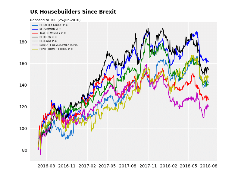
Example – UK Housebuilders
In the chart below, we plot the performance of UK housebuilders stocks since the Brexit Referendum (24 Jun 2016). First, it is clear that these stocks moved together. Note the timing of their advances. Secondly, not all stocks peaked at the same time – even if they’re in the same subsector. Some earlier; some later. Third, a stock’s relative performance tend to persist. For example, Barratt (read our Barratt Developments (LON:BDEV) share price analysis) has been underperforming the sector since Nov-’17; while Redrow has been leading the sector higher since Feb-’17.
Conclusion
Group analysis is an important part of market examination. Simply because it leads naturally to mob psychology and crowd behaviour analysis. At the heart of Group Analysis is this: Buy strength, avoid weakness. All the techniques we have discussed above lead to this strategy. Once a leader is identified, ride with it until its trend run out of strength.
*GICS Sector Groups: Industrials, Financials, Technology, Consumer Discretionary, Consumer Staples, Telecommunications, Energy, Materials, Healthcare, Utilities + Property.
Thoughts on trading the market via Breadth
A question for you: Do you analyse every market instrument every day? I suspect not. The volume of news these days is bigger than what our brains can handle efficiently. Not to mention the dynamic correlations between asset classes, linkages between politics and economics, and the complexities of trade and capital flows.
In pursuit of profits, however, humans can be extremely ingenious. We build tools to aid, expand, and improve our analytical capability. In chart reading, there is such a tool called breadth.
The idea of breadth is very simple. It attempts to measure the total strength of the market. In doing so, investors hope to gain insights into the internal movements of a market and, in turn, lead to some predictive views and profits.
Types of Breadth
There are many breadth charts. For example:
- # of issues advancing vs falling
- # of issues at long-term highs/lows (e.g. 52-week High)
- # of issues above some technical indicators (e.g. moving averages)
- average value of certain indicators (e.g. distance to 52-week highs, RSI)
… et cetera. Of course, there are other ways to build breadth charts.
To give a visual example of breadth, in the chart below, I plot four breadth charts using the simplest universe – FTSE 100 Index. This is like the S&P 100 (100+ stocks).
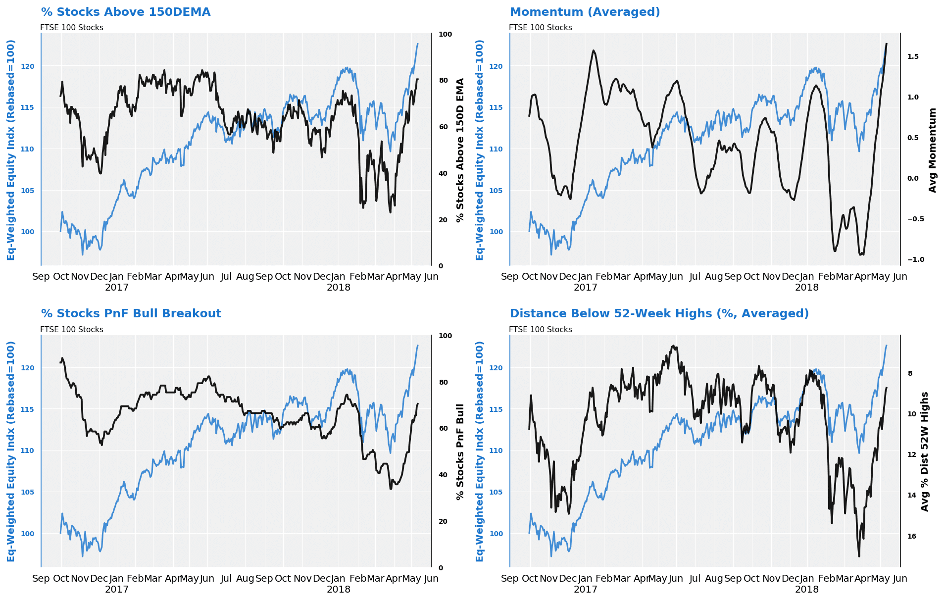
Top-left (Chart, black) – percentage of stocks above 50-day exponential moving average.
Top-right (Chart, black) – average value of the momentum of each stock.
Bottom-left (Chart, black) – percentage of stocks in bullish point-and-figure columns.
Bottom-right (Chart, black) – average distance of each stock relative to its 52-week price high.
As you can see, the way each breadth moves is different. Some are more volatile; some are smoother. Some bottomed out latter.
As a comparison, I create an equal-weighted equity index (blue line) based on the daily return of the universe component stocks (FTSE100). Because this is just a rebased, equal-weighted index, its movement differs from that of the actual FTSE 100 Index.
Using Breadth – Tips and Advice
- Remember, breadth charts are just tools. There are not crystal balls. It can not and will not predict every turning point of the market.
- The most important thing about breadth is divergence. A divergence means that the trend of a breadth differs from that of a representative index on the same universe.
- A bullish divergence means that the breadth is improving already while the index is still falling. This suggests some potential for a rally. A bearish divergence is the opposite – a rising index not accompanied by a rising breadth. This indicates internal weakness.
- For some reasons, breadth divergence works better on the downside than the upside, ie, breadth charts are better at bullish divergence. Why is that? One reason I can think of is length. Generally, bull markets are longer. So overbought conditions will persist regardless of breadth readings. As such, market breadth can weaken but the index remains strong for some time.
- Be careful when comparing breadth readings with indices. This is because every equity index is calculated differently (such as Dow vs S&P 500). Most of the time, breadth calculations are simple arithmetic whilst an equity index is weighted by different factors.
- Each breadth has its own characteristic. Pay attention to its ‘quirkiness’.
- Some breadth works better on certain markets – and during certain market conditions such as a bull market.
- The more component stocks we use, the better. Less component stocks will result in more volatile breadth charts.
Conclusion
Breadth is an important tool because it helps investors to understand markets on a broad scale – without needing to check every single stock. Once you understand breadth movements, you can derive overall market overviews with relative ease. For instance, is the market rising along with its breadth? Of course, there’s nothing to stop you from building more sophisticated breadth with basic ones, such as a ‘Breadth of Breadth’, though the KISS rule remains: Keep It Simple.
Six Market Trends To Look For Outside Individual Price Action
So far in this series, we have written about price action. This form of market analysis is the most direct and, very often, the most effective.
If someone is accumulating a stock, upside pressure will sooner or later emerge in the stock price. If a sector is under duress, its relative strength will deteriorate one way or another. If a country is being mismanaged, its currency will weaken over time.
Price action, then, is the most obvious way to ‘understand’ markets. However, is price action analysis by itself sufficient?
For many investors, the answer is no. To them, macro, fundamental, and political (MFP) factors are equally important. These ‘big things’ must be analysed because they can drive markets. For example, a stock’s price trend could change overnight when a new CEO takes over, or, a new political party wins an election. But bear in mind two things when incorporating MFP factors:
- The number of MFP factors are almost unlimited;
- MFP’s impact on markets are dynamic and time-varying. This makes modelling of MFP challenging.
For example, in 2016 markets were pricing in a Clinton win. Instead, Trump won. Markets went into a tailspin. Then, unexpectedly, it reversed and rallied hard (‘Trump Rally’). This sort of things is really difficult to predict or model.
Therefore, from a price-action perspective, we would focus on factors that are more relevant to stock market action – and applicable around the world. Note that even this self-imposed limitation, the impact of each factor will work differently depending on whether we’re in a bull or bear market. Below we show a (partial) list of these factors.
What Additional Things To Look For Apart From Price Action
- Anomalies
- Banking Sector
- Quantitative Tapering
- Stock Buybacks
- Valuation
- Excesses
We briefly discuss each in turn.
- Anomalies – Here we look for (a) Length and size of the current trend versus its historical data, and (b) Nominal, inflation-adjusted, and currency-adjusted terms of the market. Basically, we’re determining the ‘age profile‘ of a bull or bear market. If a bull market is already extended and in parabolic trends (e.g. Gold ’11) we have to be really careful about chasing it. If a market is down 60%+ and many stocks are at rock-bottom prices, it means some buying are warranted.
- Banking Sector – Why are banks important? Because they control the credit function of an economy. If the banking sector is showing (a) weak relative strength, (b) making new 52-week price lows, and (c) are breaking important trendlines / moving averages, you know the economy will be hurt by its weakness. Credit will soon be curtailed because banks can not fulfilled adequately its credit multiplier role. Watch out for sectors that are dependent on credit such as property or car.
- Quantitative Tapering – Central banks are withdrawing from QE programs around the world, including the Bank of England. ‘Normalisation’ of interest rates will put those indebted sectors (such as consumers) under more pressure because their debt payments will increase. Therefore, watch for relative weakness in these sectors.
- Stock Buybacks – The key question is: Are companies buying back their stocks with profits or debt? If the latter, it means the firm’s leverage is rising and making them more vulnerable. Also, is the amount large – so large that it is impacting the available shares? If yes, it will inevitable crease upward pressure on stock prices.
- Valuation – Is the stock market overvalued? Normally, a bull market ends on the higher side of the valuation scale. Where are we now?
- Excesses – Where are market excesses developing? Answers will reveal themselves when you see (a) stocks up 5x-10x from their lows, (b) sectors that are accumulating debt at a rapid pace without an equivalent increase in their earnings power, (c) sectors that recently relax credit quality, (d) underlying prices up 100-400% from their lows (e.g., property prices, raw commodity prices).
Conclusion
Markets do not exist in a vacuum. Its flow is shaped by a myriad of players, factors, and events – some of which are ‘black swan’ that are not expected by markets. The elements discussed above are applicable to most stocks markets around the world, including developed and emerging. Once you understand the behaviour of these factors, you could develop simple rules to evaluate their impact systematically. Setting benchmarks is the only way you can determine what to do during market turbulence.
The Key To Long-Term Investment Success – Know Yourself…
Over the past few weeks we discussed market analysis techniques. In particular, we examined:
- Indicators (e.g. moving average, trendlines)
- Price Patterns (e.g. price breakout, trends)
- Market Analysis (e.g. breadth, relative strength)
All this knowledge is important. But they are insufficient for you to generate wealth from investing. To successfully investment, there is a cardinal rule you must do: Investment Planning.
Investment Planning
What is investment planning? In a nutshell, it is about creating a series of personal rules on capital allocation. And why is this important? Because without these ‘rules’, you will not have financial discipline. More likely than not, you will be ‘lost’ in the financial jungle and be parted from your hard-earned cash (fairly quickly). Billionaire investor Warren Buffett did not become fabulously wealthy by investing haphazardly. He has a lot of rules about how he invests his money – and he follows them strictly. So should you.
The first thing about investment planning is knowing yourself. It is not about markets, economic cycles, or indicators. It is about understanding your own strengths and weaknesses. For example, the first thing Jim Rogers, the legendary investor, admits is that he is utterly ‘hopeless’ in short-term trading. So he focussed all his energy towards long-term investments – with huge success.
Do you like short-term trading or long-term investing? Do you have some (above average) skills that you can exploit to earn investment returns? Are you knowledgeable about investment vehicles (stocks, foreign stocks, REITS, ETFs, Investment Trusts, Gilts, FX rates, etc)? Do you require investment advice or can you do it alone? Do you have time to follow markets – day in, day out? Have you had any experience bull and bear markets? Have you got any idea how market cycles behave? Can you tolerate (low, moderate, or high) price swings in your portfolio? Can you read a balance sheet well? What about economic indicators, are they your forte?
In a two-column paper, answer the above questions as honestly as you can. If you are not, you will have difficulties following your plan later. If you think you’re not really good or knowledgeable about investing, hire some experts to do it for you. Alternatively, you can learn to do it yourself.
Next, establish what you want from your investments. But be realistic about two things. One is your expected investment returns. Two is your current cash flow. The latter is tied to your personal circumstances, such as income level, current expenditure, and unexpected expenses. Why is cash flow so important? Because you can plan towards establishing a reservoir of firepower. Why is this additional firepower important? So that you can buy stocks when they trade at bargain price levels. This is the key to investment success.
‘Buy low, sell high‘ is an age-old motto. But if you have no money to buy when prices are low, then you will accumulate wealth at a far slower pace. Compare these two investors, Sam and John, who both started out in 2007 with $10,000. During the year, Sam saved another $5,000 in cash whilst John immediately bought more stocks with the same amount. Market crashed the following year. Sam used the $5,000 to buy stocks are far lower price levels whilst John watched helplessly on the sideline. Fast forward to now. Whose portfolio is larger? And, guess what did Warren Buffett frantically do in 2008?
Once you have determined your assets (knowledge + capital), you can then set basic investment strategies to pursue your objectives. This includes:
- What type of securities to buy and hold (stocks, REITS, ETFs, Gilts etc)
- How to buy (entry rules and signals)
- How to sell (sell rules and signals)
- Establishing pain levels (stop losses)
- Setting your diversification rules
- Setting your leverage rules
- Building a reserve fund to acquire securities during market panics
The last point worth stressing concerns compounding. Great investors make their capital do the work for them. ‘Making money whilst snoring’ so to speak. To prevent a break in the compounding cycle, invest capital that you should be able leave aside for years. If you consume this seed capital halfway, it would not grow to a big tree.
Conclusion
The three pillars of planning are (1) understanding yourself, (2) establishing your objectives and risk preferences, and (3) implementing your investment rules.
If you skip (1) and (2) and then adopt someone else’s plan it would not work. Because you will find it hard to follow the rules and signals because the plan is incompatible to you.
‘What then?’ you may ask. ‘After drawing up a plan, will I achieve investment success?’ Well, nothing is 100% guaranteed in life – especially on investments. But if you don’t have an investment plan, you’re more than likely to end up in places where you don’t want to be. With a map, you will at least have a fighting chance to reach your destination.

Jackson is a core part of the editorial team at GoodMoneyGuide.com.
With over 15 years of industry experience as a financial analyst, he brings a wealth of knowledge and expertise to our content and readers.
Previously, Jackson was the director of Stockcube Research as Head of Investors Intelligence. This pivotal role involved providing market timing advice and research to some of the world’s largest institutions and hedge funds.
Jackson brings a huge amount of expertise in areas as diverse as global macroeconomic investment strategy, statistical backtesting, asset allocation, and cross-asset research.
Jackson has a PhD in Finance from Durham University and has authored over 200 guides for GoodMoneyGuide.com.