This report covers UK shares that have a 52-week high or low, closing higher or lower for the week. A good indicator for buy and selling. A Weekly Buying Climax occurs on a 52-week high, closing lower for the week. A Weekly Selling Climax occurs on a 52-week low, closing higher for the week.
UK Shares with Weekly Buy & Sell Climaxes
Should You Buy Or Sell When A Stock Fails To Maintain A High Or Low And Climaxes?
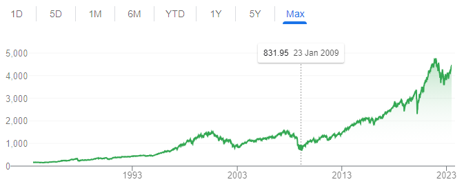
Selling at the exact top and buying at rock bottom are the dreams of many aspiring traders. Imagine you put the bulk of your net worth on the S&P 500 on 9 March 2009. You’d have earned the bragging right of a lifetime. A difficult endeavour, but not impossible. To this end, traders and investors employ as many technical indicators as possible to give them an ‘edge’ on picking turning points in the market. One such useful indicator is the Weekly Buy/Sell Climax.
This is a contrarian indicator because it tries to capture trend exhaustion. By itself, the indicator may not be the most reliable pattern. But if we start applying the detection to a large section of the market, it may be a useful indicator to monitor.
This guide summarises what buy and sell climaxes are, with a few examples to show readers how to use it.
What is a Weekly Buy Climax?
Definition: To generate a weekly “Buying Climax” requires two conditions.
- During the course of a week, prices rally above its prior 52-week highs.
- This same stock ends the week lower than the previous week.
Interpretation: What this means is that the stock rises to long-term highs but fails to close higher. Instead, prices close weak and slip beneath its previous week’s level. A lack of upside follow-through suggests buying fatigue. This may spell some price weakness ahead.
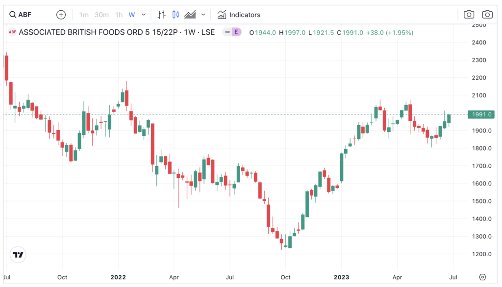
Example: A Buying Climax is easily detected using computer programs since the conditions are known ahead. Using some computer algorithms, I find one recent example of the Buying Climax in the UK– ABF Plc (ABF), owner of the popular retail chain Primark.
As showed below, the conglomerate exhibited two Buying Climax during March and April of 2023. The first happened after an extended run from 1,250p. Prices rallied to new 52-week highs near 2,100p in early March but closed down for the week. The next week saw a 5.7% decline. But there was no further downside follow through.
After a five-week rally back to 2,100p, ABF generated the second weekly buying climax near the 2,100p resistance and closed down 4.4%. This was a far more serious pattern. Prices dropped for the next four consecutive weeks.
What Is A Weekly Sell Climax?
Definition. A weekly “Selling Climax” has two similar conditions.
- During the course of a week, prices register a 52-week low.
- Then, the stock finishes the week higher than the prior week.
Interpretation: A stock that drops to long-term lows is a bearish event. This means that the stock is under immense selling pressure – since the only way for a stock to reach 52-week lows is that there are more sellers than buyers. However, in rallying sharply off the lows is a sign that changes are afoot. Perhaps the stock price is low enough to attract bargain hunters, thus setting technical floors.
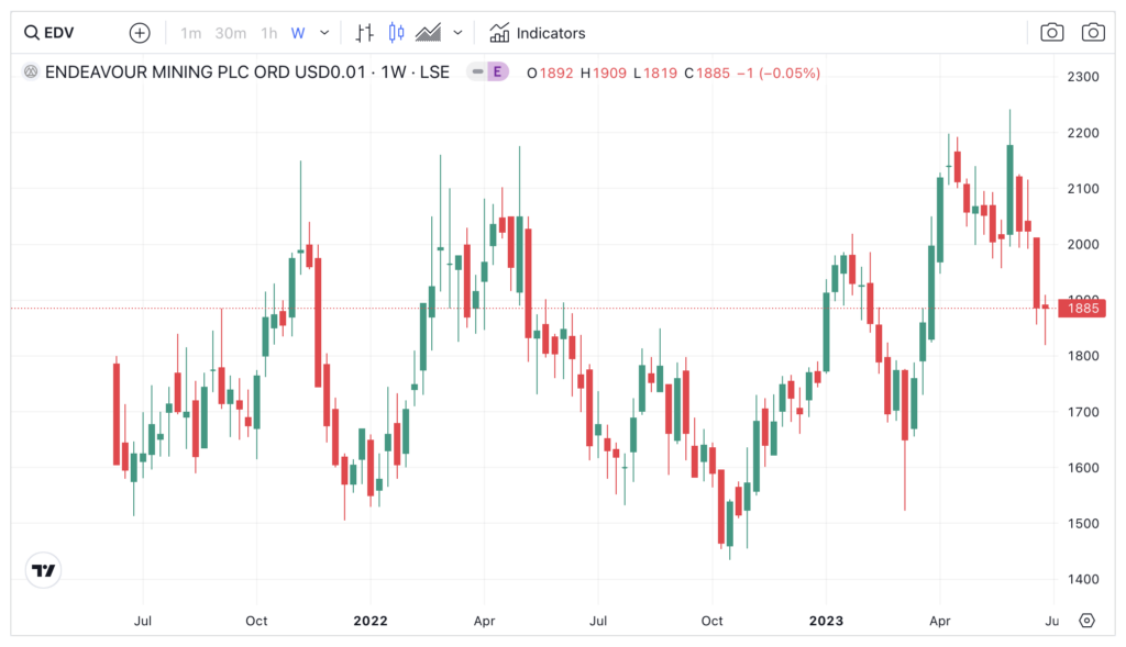
Example: Using computer programs I find an example of a Sell Climax in the mining sector – Endeavour Mining (EDV) – that is worth looking at. The Africa-focussed miner (corporate presentation) was recently listed in the London Stock Exchange in 2021. After a year of trading, prices drifted into the lower side of the trading range, which culminated in a bearish breakout in October 2022 (see below).
Predictably, upon the development of this pattern EDV dropped further the next week. New lows always attract sellers. A breakdown like that scares investors into dumping their shares.
But then the gold-mining stock did not close into weakness. In fact, it rallied by more than 5% the next week. It generated a ‘Sell Climax’. With the benefit of hindsight, that selling climax marked the start of a 9-month uptrend.
But it wasn’t all that clear then. Prices were knocking on the underside of the former range (1,500p-1,600p). It was not a ‘sure thing’ that a major rally is about to begin. Still, the sell climax suggests that EDV was not generating a clean breakdown.
Therefore, pay attention to “follow-through” after a breakdown occurs. If a stock is not behaving in a way that its consistent with its medium-term trend, be it down or up, perhaps it is a good idea to step back and reassess.
Aggregate Buy/Sell Climaxes Are More Informative
By itself, a Buy or Sell climax does not have huge predictive power. A stock can always negate the climax the next week. This neutralises the trend-changing impact of the pattern.
Moreover, a stock can generate a sell/buy climax multiple times during a long trending period. In the above buy climax example, ABF generated two Buy Climaxes in a few short weeks. Yet prices did not crater.
But does it mean these buy and sell climaxes are pointless and should be discarded? Well, no. Climaxes become somewhat useful when we apply this pattern to the whole stock market.
For instance, if many stocks produce a buy or sell climax simultaneously, it may signal something important about the stock market. It could be suffering from momentum fatigue.
Remember that a Buy/Sell Climax requires a stock to reach 52-week Highs/Lows. By this measure alone, prices would have been trending for some time already prior to a buy or sell climax.
When multiple upside or downside failures appear together, this mean that these running trends are potentially exhausted. Buyers who needed to buy have already bought; sellers who wanted to exit have sold. There is no buyers or sellers left at turning points.
Example 1 – FTSE 100
Here I use the UK FTSE 100 as the first example. This index is made up of 100 blue-chip stocks which are the largest stocks by market capitalisation (market-weighted) in the London Stock Exchange.
I tally all the buy and sell climaxes for each week for the last 70 weeks (all the way back to March 2022). Then I overlay these calculations with the FTSE 100 index as proxied by the ETF iShares FTSE 100 (ISF).
Here you can see that as the index falters from its peak in March and May, the number of buy climaxes increases. In late May, for example, 7 Buy Climaxes were detected. Soon after, the index started to falter.
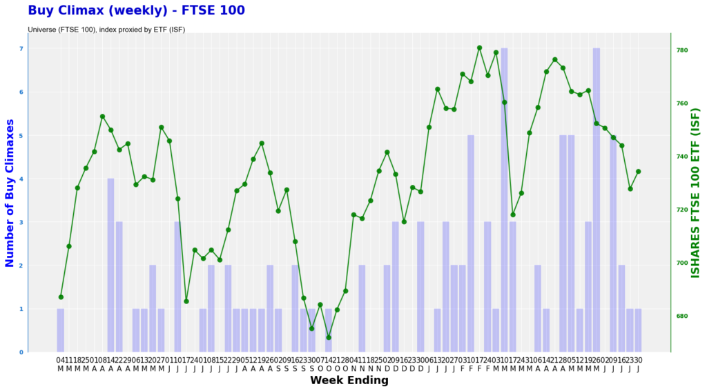
And if we look the FTSE 100’s sell climax, the opposite occurred. During Truss’s chaotic administration in October last year, the index started to detect more sell climaxes. Many stocks are entering new year lows but failed to close lower. This means that the selling pressure since August was abating.
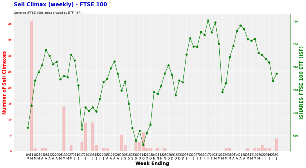
You may, however, think that the number of climaxes detected on the FTSE 100 universe are too low. How can this be a reliable pattern based on, say, only five climaxes?
You have a point. As such, we need to apply the algorithm on as many stocks as possible.
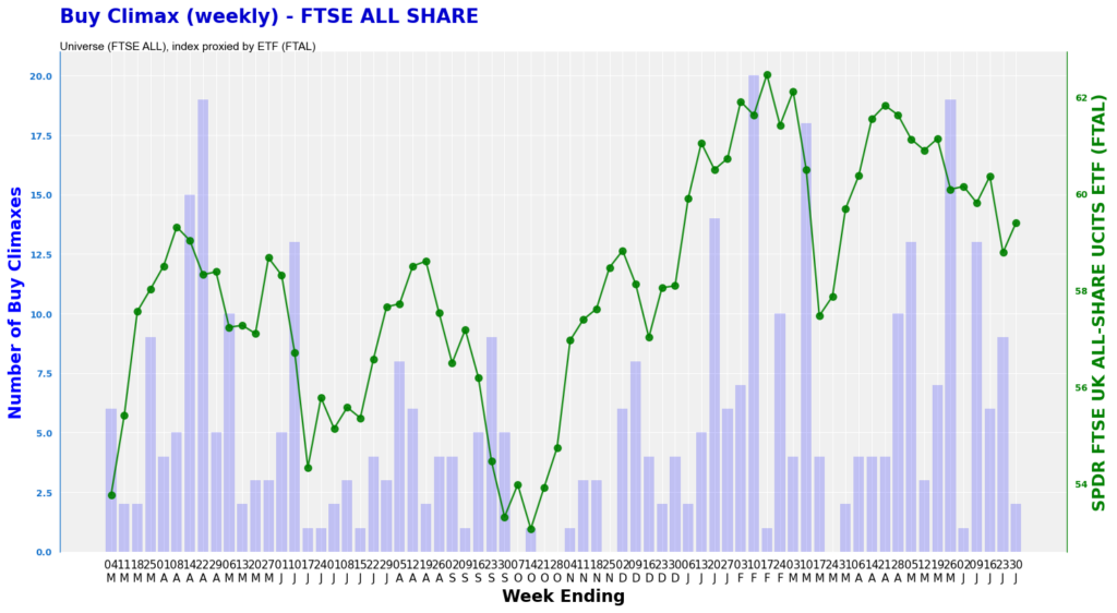
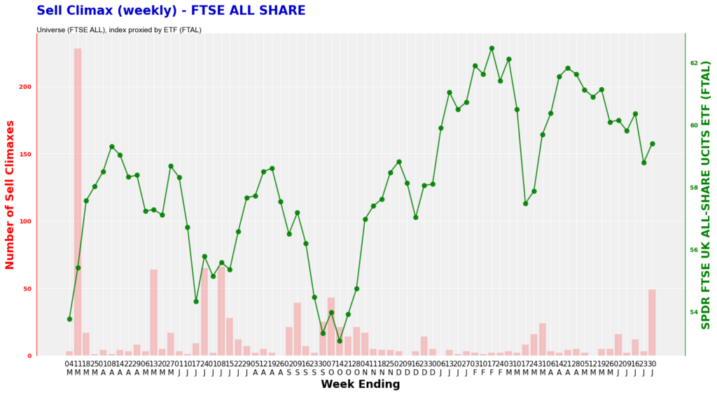
Example 2 – FTSE ALL SHARE
In this section, I use the FTSE All Share universe to apply the Buy/Sell Climax recognition.
The FTSE All Share is comprised of FTSE 100 (largest blue chips), FTSE 250 (mid-caps) and FTSE Small Caps. In total there are around 576 stocks (London Stock Exchange FTSE All Share – info link).
Like above, I overlay the number of buy climaxes with the FTSE All Share Index, as proxied by the £650 million SPDR FTSE All Share ETF (FTAL, factsheet)
According to the chart below, the number of Buy Climax shot up during February and again in late May. This coincides with a period of weakness in the Index.
For the sell climax, it is evident that the number of this pattern increases at market lows. For example, during October of last year the overall sell climax rose to near 50. The number of climaxes was sustained at double digit for a few weeks.
Soon after, the index rallies significantly from that low.
Climax Extensions
No indicator is perfect. There is always room for improvement.
To make these Buy/Sell Climaxes better, apply them to largest number of instruments in the stock market to get the widest scope of market buying/selling pressure. Furthermore, use this indicator alongside other breadth charts to gauge the overall health of the market.
Of course, you can tweak the measurement of the Buy and Sell climaxes. For example, you may use 40-week high/low instead of 52-week. Another change is to use closing price instead of intra-day high and low.
The key here is to use the same parameters consistently. Only then you can read the buying and selling pressure better.
Climax Tops
A Climax Top is a chart pattern the records the sudden increase in prices following a long uptrend. This usually marks the end of a cyclical rally.
Selling Climax Candles
A selling climax candle is a candlestick pattern that coincides with a weekly selling climax. The peak of the candle usually is a new 52-week high, followed by a weak close.
Selling climax indicators
A selling climax indicator is an indicator that marks the potential end of a bear trend. Chart patterns include new long-term lows but a sharp rally off that low on significant volume.